Font and Layout Variability Effects on OCR Error Rates
Document prep choices like font and layout matter far more than the OCR engine itself.
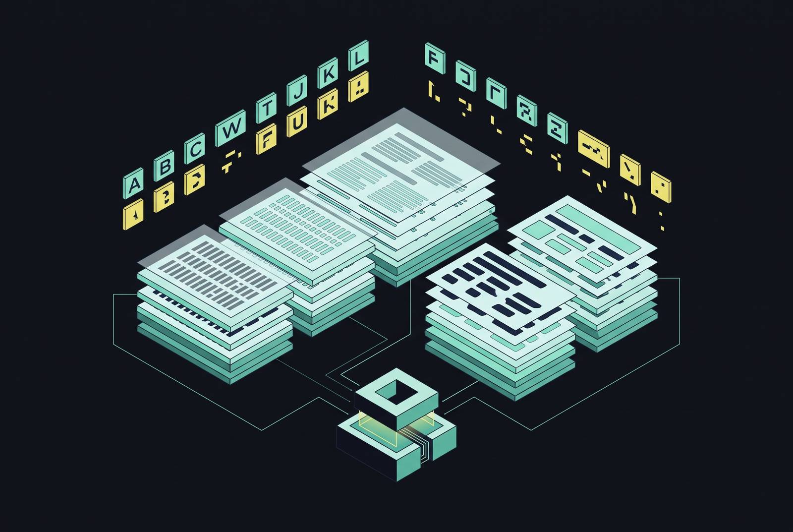
Font family, size, layout, resolution, and contrast determine whether OCR accuracy reaches 80% or 99%. Most setups fall short of that top range, and a bad engine usually isn't why. It's the decisions made before the engine ever sees the page. With the right setup, printed text reaches 98 to 99% accuracy, so if a project falls short of that, the fix is a better document, not a better engine.
This cost curve affects budgeting just as much as engineering. Moving from 80% to 90% accuracy takes a fair effort. Getting from 90% to 95% is much pricier, and hunting for 99% means each extra tenth of a point costs way more than the last. Once you know which levers really lift accuracy, you can spend deliberately rather than pouring compute and post-processing budget into a problem better document prep would have fixed for free.
How font family choice sets the ceiling on what any OCR engine can achieve
Font family affects accuracy more than any other typography choice, yet most document teams still choose fonts for looks, not machine readability. That logic is reversed. What's easy for humans to read usually isn't what machines handle best. In code-text OCR tests of Consolas, Arial, Courier New, Times New Roman, and DejaVu Sans Mono, DejaVu Sans Mono achieved the highest accuracy among tested fonts.
The serif-versus-sans-serif debate is messier than standard design guidance claims, and that guidance doesn't hold up here. Low-contrast sans-serif typefaces, where the strokes stay near-uniform in thickness, usually give OCR better results. With serif fonts, it's the opposite: high stroke contrast works better. A 1999 review found no clear comprehension advantage between serif and sans-serif fonts for human readers. A font chosen for people to read and one chosen for OCR accuracy aren't the same, yet most document teams wrongly treat them that way.
Mixing typefaces within one document carries its own cost. Changing typefaces can disrupt OCR performance, increasing errors where fonts meet. Weight, though, hardly makes a difference: Recent research shows thin and bold typefaces perform similarly with modern models, so it's a variable you can stop worrying about.
Before anyone picks an OCR tool, the cheapest accuracy fix is using one well-supported font family across a document set. It's free, and no tool you pick later can push past the limit it creates. Ignore it and the results are capped before the engine even runs.
Historical and stylized fonts as an extreme case of what font family does to error rates
Printed text from the eighteenth century reveals the outcome when font-family variability reaches its extreme. Non-standard spelling, old letterforms like the long-s, dense ligatures, multiple typefaces on a single page, and wear-and-tear on the paper all pile up together, and a ready-made OCR engine designed for modern print usually buckles under the mix. Anyone expecting a general-purpose engine to power through a historical corpus is in for a bad surprise.
These mistakes don't show up at random. They cluster around particular typography and print conventions, with certain substitutions, insertions, deletions, and word-boundary errors popping up near known problem glyphs once the font style is recognized. Historical typefaces fall into eight families: Antiqua, Bastarda, Fraktur, Gotico-Antiqua, Italic, Rotunda, Schwabacher, and Textura. Each has its own oddities in size, proportion, and letterform design, and each affects how an OCR engine misreads it, and how often.
In 2025, Fleischhacker and colleagues studied the Schematismus, 19th-century Habsburg administrative records with multi-column, multi-level layouts. They combined machine-learning layout detection with a fine-tuned Tesseract model, dropping character error rate by 15.68 percentage points and word error rate by 19.95 percentage points compared to the baseline. That's what separates a research-ready corpus from a useless one. In every test so far, pipelines tuned to the font type have outperformed general-purpose OCR engines on stylized text, which leaves a blunt rule: collections of historical or heavily stylized fonts require purpose-built or fine-tuned models. Relying on a stock engine here isn't a technical risk. It's a planning mistake.
Font size thresholds where accuracy deteriorates and where it stabilizes
Size matters more than many people think, and its impact changes by script. Tesseract struggles with text below 7-point size, even in clean images. Accuracy peaks in the 13 to 22 range, and smaller font sizes, particularly around 8 to 10, yield worse results, with low-resolution scans further reducing accuracy. They compound. Aim for 10 to 12 point font as a practical minimum for better results.
A 2024 arXiv paper testing GPT-4o on Urdu OCR reveals just how much ligatures and diacritics hurt accuracy. Word error rate fell from 0.50 at 12-point type to 0.24 at 18-point and 0.21 at 24-point. BLEU scores, a measure of how well the recognized text preserves meaning rather than just characters, climbed from 0.48 to 0.73 over that same range of sizes. Small Urdu type adds far more than a handful of typos; it breaks meaning at scale, as errors pile up across ligature-heavy words. Latin-script languages in the same study, including Albanian and English, kept low word error rates at every tested size. How much size matters depends on the script first, and it's worst where ligatures and diacritics blur into ambiguous shapes at small point sizes. Weight hardly matters here either; size is what counts.
How document layout independently degrades accuracy, even when typography is clean
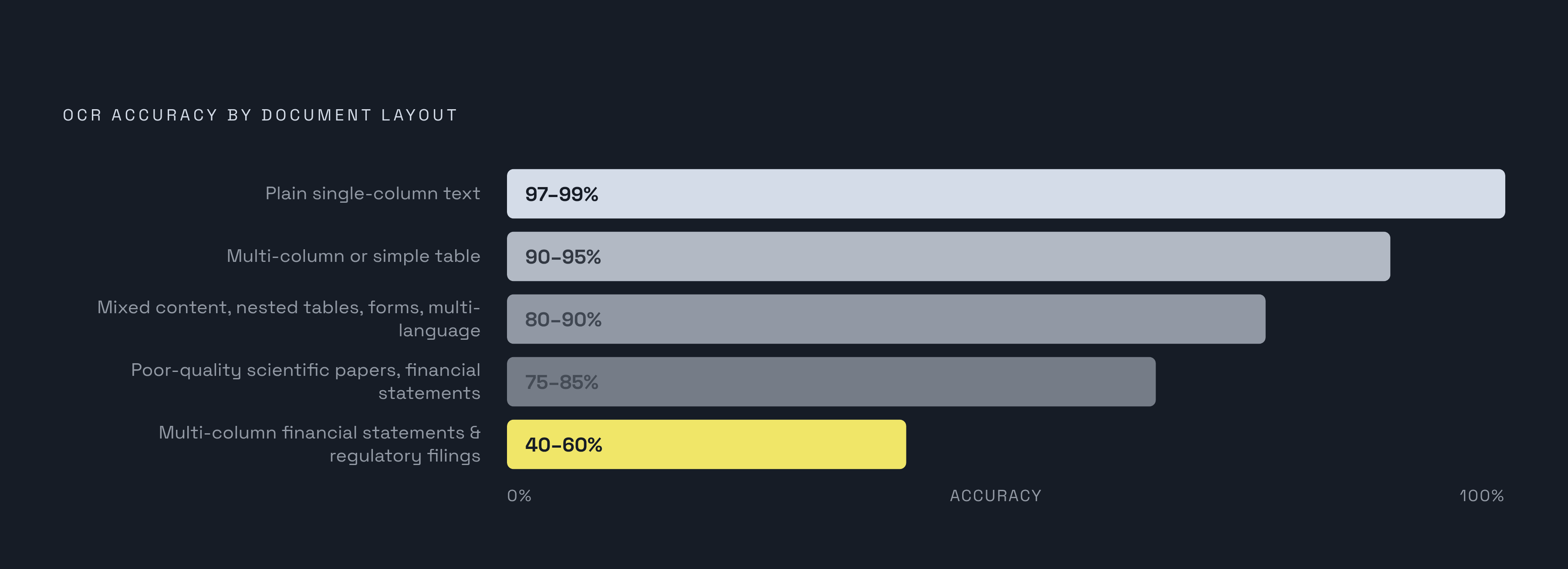
Layout can tank accuracy even with the right font and size, and that's the part budget owners underestimate most. Plain single-column text hits 97 to 99% accuracy. Add multiple columns or a simple table, and accuracy falls to 90 to 95%. Pages mixing content types, nesting tables, adding forms or handwriting, or using several languages drop to 80 to 90%. Poor-quality scientific papers and financial statements pile up these issues, dropping to 75 to 85% or worse: multi-column financial statements and regulatory filings can fall to 40 to 60%. That's not a penalty, it's a failure of the whole extraction.
No layout type gives the pipeline more trouble than tables. A 2024 arXiv study found that even specialized table-extraction models reach only 62 to 78% accuracy on tables with merged cells or irregular structure, over 20 points under their simple-table results. Standard OCR struggles even more with these layouts, falling to 60 to 80% row-level accuracy on complex tables that have merged cells, nested headers, or uneven column widths. If a document set relies heavily on tables, handle that factor before font or resolution.
Line spacing ranks among the worst layout offenders, worse than most designers expect. Qwen, Claude, and GPT-4o perform poorly with tight line spacing, improving as spacing increases. Text alignment has less impact on accuracy than other layout factors. In one document, font size and alignment often change between sections, especially near headlines, adding layout problems to any font issues already there.
Why a 2% error rate can be acceptable in one context and catastrophic in another
A low character error rate looks okay in a presentation. It sounds a lot worse when you see that errors aren't spread evenly across a page: they bunch up on the fields that count, policy numbers, dollar amounts, medication dosages. On complex documents like insurance policies, loan packages, or medical records, misreading the layout can wreck more than a single cell. It spreads to every field identified by where it sits on the page, not just by its content.
A system can hit 95% on raw text extraction and still fail in production if layout detection sits well below the extraction rate, because any document where field identity depends on position, not just recognized text, breaks under that gap. Sorting errors by type helps you triage. OCR errors follow predictable patterns, not chance: substitutions, insertions, deletions, word-boundary slips. Spotting the pattern shows you in advance where the damage will hit.
Across more than 1,500 real production documents in logistics, healthcare, financial services, and real estate, Extend's RealDoc-Bench records 0.847 adjusted F1 for layout accuracy and 95.7% accuracy on document question-answering. The same benchmark produced both numbers, and their gap is the key point: aggregate accuracy and task-level accuracy measure different things. Decide your error limits per field, not per document, before you choose a tool or budget for cleanup.
Color contrast and image resolution as compounding factors that interact with font and layout choices
By one measure, text-background contrast is the biggest single driver of TrOCR model accuracy, outranking factors that earlier assessments of that model family had treated as more important. Because of that gap, Transformer-based OCR models benefit when contrast is prioritized in training, rather than treated as an afterthought.
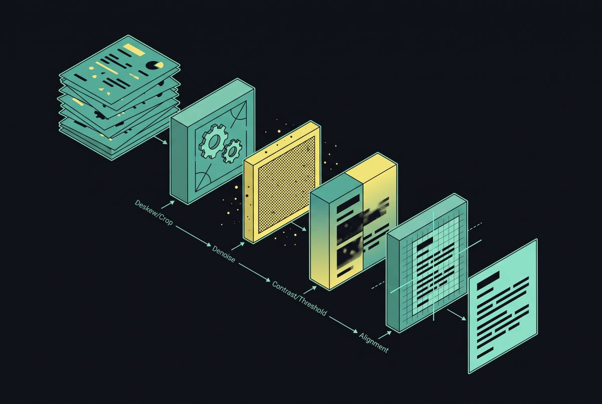
Resolution creates its own limit. You need 300 DPI or more to capture the fine detail that tells similar-looking characters apart. A 75 DPI scan performs poorly, and post-processing cannot fully recover lost detail. Preprocessing techniques like binarization, deskewing, and denoising can improve accuracy without altering the original document.
These variables never work in isolation. Even with a good font at a comfortable size, a document can still do poorly if it was scanned at low DPI or low contrast, since the imaging and typographic layers work together rather than separately, each undermining what the other gets right. That’s why it makes sense to set resolution and contrast early: they’re the cheapest things to control during digitization, and rescanning a bad image corpus later costs far more than setting a scanning standard first.
When to choose traditional OCR engines versus modern vision-language models, given what you now know about the error drivers
Older tools like Tesseract work best under ideal conditions: clean, single-column pages with one font, good size, and sharp resolution, which is how you get 97 to 99% accuracy. On documents like that, anything heavier is a waste of money. Spending on a vision-language model for a clean single-column invoice is money spent solving a problem that doesn't exist.
Complex documents change the calculation. Modern vision-language models beat classic OCR by a lot on tables, mixed content, old or fancy fonts, and multi-column pages, so keeping an older engine just out of habit costs more than it saves. Six major open-source OCR models dropped in October 2025 alone: Nanonets OCR2-3B, PaddleOCR-VL-0.9B, DeepSeek-OCR-3B, Chandra-OCR, OlmOCR-2-7B, and LightOnOCR-1B, all aimed at layout preservation and structured output, where traditional engines fall short. Transformer and multimodal setups like LayoutLM handle tables, columns, and complex page layouts in a single pass, rather than treating text extraction and layout detection as two separate, loosely connected steps.
Running OCR first and then cleaning it up with a multimodal large language model can cut character error rate to about 1%, near human-level transcription. An Arabic OCR study found that a broadly trained generalized model achieved 97.41% total character accuracy and 98.46% on Arabic script, outperforming typeface-specific models. That result pushes back against the urge to over-fit a model to one typeface, since a well-trained general model just does better, and narrow specialization is often a bad bet.
No one engine handles everything, so don't look for a single best option. It's about pairing the engine with the document type and using hybrid or ensemble setups when quality and layout shift between batches. LLM-based OCR fixes errors using context, handles unfamiliar layouts with zero or few shots, and truly understands layout, but it's pricier to run. Traditional OCR still handles high-volume, low-complexity work at lower cost.
A decision framework for document preparation, tool selection, and post-processing investment based on your specific variables
Audit first, pick a tool later. Check font consistency across the document set: is it one family, or several? Look at size: below 10 points, or above 22? See whether the layout is single-column, tabular, multi-column, or mixed. Check script style: Latin, or historical with many ligatures? Look at scan quality: is it 300 DPI or better, and how's the contrast?
Then set accuracy targets field by field, not for the whole document. Pin down which fields matter most, because that's where a low aggregate error rate quietly hurts you most, even when the summary metric looks fine.
Lock down the easy wins before you open any OCR tool: set a 10–12 point font size floor in document prep, pick one font family and stick with it, scan at 300 DPI or higher, and run preprocessing (binarization, deskewing, denoising) before any OCR model touches the image. They're cheap to do, and they lift the limit for every tool that follows. The most common mistake in this whole pipeline is skipping them and hoping a better model will make up for it.
Next, pick an engine that fits the tier. Traditional engines work well for simple, clean, single-font documents. Tough cases like complex layouts, historical fonts, or mixed content need modern vision-language models, the October 2025 open-source cohort among them, or a pipeline fine-tuned for that document type. For high-stakes fields, add LLM-based post-processing to move closer to that 1% character error rate.
Finally, plan your budget around the cost curve. Going from 80% to 90% accuracy is much cheaper than going from 95% to 99%, so pick a target based on what mistakes actually cost you, not some neat number that just sounds good. Benchmarking against real, representative documents with character and word error rates plus field-level metrics is the only reliable way to track this, not the headline number on a vendor's product page.